总结手机应用设计的7大误区
作者:John Koetsier
在《安娜·卡列尼娜》中,列夫·托尔斯泰这样写到,“幸福的家庭都是相似的,不幸的家庭却各有各的不幸。”奇怪的是,手机应用领域也是如此。
优秀手机应用通常存在系列共性:精致、操作便捷、美观、能够完成预期操作。而糟糕应用则就千奇百怪。
设计手机应用时,有若干常见误区需要避免。下面是手机应用设计的7个常见罪状:
1. 激进现实主义
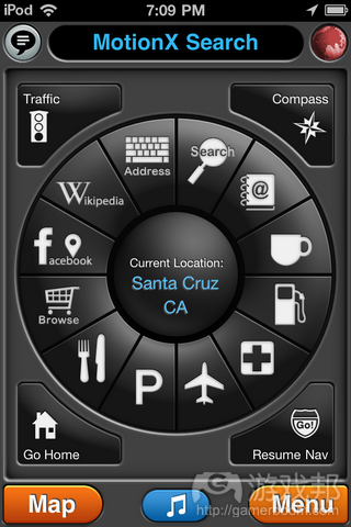
你着迷于应用的力量,但如果你在应用或设计中填充过多内容,那么用户将对你的游戏丧失兴趣。
想想Bump(游戏邦注:方便手机间数据分享的应用)。起初,应用允许用户传输音乐和应用推荐,还有就是联系方式、图片及其他信息。但用户在此显得有些手足无措,所以开发者便去除应用的功能性,只允许联系方式和图片传输。随后应用便开始越发受欢迎。
保持简单性很容易。简单的东西容易理解。简单的东西很受欢迎。
2. 不一致性
确定设计语言,然后贯彻到底。显然设计主要围绕具体运作方式,而非仅是所呈现的外观。所以务必就用户页面切换方式、菜单运用方式、标签、按键或其他用户界面元素设定标准。考虑用户界面细节,例如何处采用弹出窗口,何处无需弹出窗口。
尽量维持所选平台的标准外观和感觉,至少要在内部保持连贯性。这让用户能够更直观地学习如何使用你的应用,促使他们持续返回。
3. 过度设计
想想史蒂夫·乔布斯:如果产品已达到最大限度的简单性,那你就大功告成。或是像米开朗基罗,他会在雕刻时将环绕于所选造型周围的大理石去除。
设计应用时,你应该表现得坚决彻底:去除多余视觉装饰内容、无意义的元素及多余的图像内容。设计不仅涉及需添加什么元素,还包括避免融入什么元素,所以可以先从界面设计着手。
4. 速度
就像《汽车总动员》中的史蒂夫·麦奎因所想的那样,速度,速度,我就是速度。
用户并不在乎你是否是通过非3G网络连接加载数据。或者你的精彩动画是因手机CPU而无法流畅运行。
执行加载缓慢的动画,谨慎看待需加载的庞大图像和背景。允许用户取消耗时过长的操作,在下个互动中加载最少数量的数据。
更好的办法是,预先加载用户下次也许会需要的信息。
5. 过于繁琐
应用的不成熟表现在,编辑不够彻底,没有进行再次思考、重新构思及测试(游戏邦注:进而将冗长繁琐的标签、文本和菜单去除)。
如果你需要这类详细的标签和指示,那说明你的应用没有达到该有的清楚、简单和直白标准。确保团队有位真诚的创作者,能够去除所有繁琐元素。然后自己进行再三思考,直到确保一切妥当。
6. 非标准互动
平台之所以是平台部分是因为它们包含系列特性,让用户能够在此生态系统中感觉到熟悉和舒适:他们清楚会出现什么,他们得到预期的东西,然后利用所得到的东西。这是Mac平台优于Windows平台的最大特点:更多标准的人性化界面指南。
了解自己的平台。考虑用户熟悉的标准操作。不要设置需要四根手指从左滑到右,或者两根手指在斜线上进行拖曳的复杂操作。
保持简单性。
7. 依赖Help按键及FAQ内容
你不能直接保存附有Help功能或是FAQ内容的设计糟糕应用。看看你所利用的最佳应用,你所喜欢的那些应用。它们是否设有帮助按键?FAQ版块?植入使用应用的用户支持?
添加Help按键意味着放弃易用性,那你就无法胜出,你就算是放弃了。
附加内容:背景图像
若你想让人觉得应用是由业余人士或是应用生成器平台完成的,那你可以利用背景图像,在上面大量放置文本和UI元素。
总结
避免在应用开发中犯下愚蠢错误的最佳方式是什么?下载及使用大量优秀应用。注意它们的运行方式,以及它们带给你的感觉。然后问问自己:我在使用自己的应用时是否也有相同的感觉?如果没有,那么你还需要付出更多努力。(本文为游戏邦/gamerboom.com编译,拒绝任何不保留版权的转载,如需转载请联系:游戏邦)
The 7 deadly sins of mobile app design
By John Koetsier
In Anna Karenina, Leo Tolstoy wrote that “happy families are all alike; every unhappy family is unhappy in its own way.” Oddly, the same could be said of mobile apps.
The best mobile apps share a set of common characteristics: they are elegant, effortless to use, pleasant to look at, and accomplish something needed or wanted. The worst apps face-palm hilariously in a wide variety of ways.
There are some common pitfalls to avoid when designing your own mobile app. Here are the seven deadly sins of mobile design:
One: Kitchen sink
You are in love with the power of your app, but no-one else will be if you try to cram too much into it, or too much into your design.
Think of Bump, the app for sharing data between phones easily. At first, the app allowed you to transfer music and app recommendations along with contact information, photos, and other things. Users didn’t know what to think, so the developers stripped functionality out of the app, only enabling the transfer of contact information and photos. And that’s when they took off.
Simple is easy. Simple is understandable. And simple is marketable.
Two: Inconsistency
Set a design language and keep to it. Design, of course, is about how it works, not just how it looks. So set standards for how users move from page to page, how you use menus, tabs, or buttons, and other user interface elements. Think about the small user interface details such as what uses a pop-up and what doesn’t.
Stick to the standard look and feel of your chosen platform(s) as much as possible, and ensure that internally at least, you are consistent. That makes learning how to use your app much more intuitive for users and will keep them coming back.
Three: Over designing
Think like Steve Jobs: You’re finished when it’s as simple as it could possibly be. Or like Michelangelo, who sculpted by removing the marble that surrounded his chosen shape.
When designing your app, you should be ruthless: kill extra visual flourishes, meaningless elements, and the shouldn’t-we-have-something-there images. Design is as much about what you don’t include as what you do include, so start parring down your interface.
Four: Speed (the lack thereof)
Think like Steve McQueen in the Cars movie. Speed, speed, I am speed.
Your users don’t care that you’re loading data over a barely-3G connection. Or that your outrageously cool animation is suffering from puny mobile CPU syndrome.
Execute the long loading animation, and be careful about large images and backgrounds that have to be loaded and stored. Allow users to cancel operations that are taking too long, and load the minimum of data needed for the next interaction.
Better yet, pre-load information that users might be requesting next.
Five: Verbiage
There is almost no clearer sign of an immature app that has not been exhaustively edited, re-thought, re-imagined, and tested to destruction that labels, text, and menus that are unnecessarily long and wordy.
If you need such extensively detailed labels and directions, it’s a clue that your app is not as obvious, easy, and straightforward as it ought to be. Re-think. Get second opinions. Ensure you have a bona fide writer on your team who can slice and dice verbiage for breakfast. Then second and third-guess yourself until you know you have it right.
Six: Non-standard interaction
Platforms are platforms in part because they embody a set of characteristics so that users develop familiarity and comfort in the ecosystem: they know what to expect, they get what they expect, and they can use what they get. This has been on of the Mac platforms biggest advantages over the Windows platform: more standard human interface guidelines.
Know your platform. Consider the standard actions that users can be expected to know. And don’t do amazing wonderful things when four fingers are swiped from left to right, or two fingers drag on the diagonal.
Keep it simple, stupid.
Seven: Help-and-FAQ-itis
No, you cannot save a confusing and poorly designed app with a Help feature or FAQs. Look at the best apps you use, the ones you love. Do they have help sections? FAQs? Built in customer support for using the app?
Adding a Help is a white flag in the usability war: you’ve surrendered, you can’t win, and you give up.
And a *free* bonus: Background images
If you want to send a massive signal that your app has been created by amateurs or a app-builder platform, use background images and put text and UI elements over top of them.
Summing up
The best way to avoid making stupid app development mistakes? Download and use a lot of good apps. Notice how they work, and how they make you feel. Then ask: do I feel the same way when I use my app? If not, you’ve got some work to do.(Source: venturebeat)


