优化玩家体验的3大游戏设计原则
- 和谐牌河蟹 - GamerBoom.com 游戏邦一般来说,我不赞同通过系列规则教授游戏设计. PvP游戏的最佳死亡设计也许不是PvE游戏的最佳决策;第三人称打斗游戏的控制装置也许并不适应第一人称射击游戏,“休闲”游戏和“硬核”游戏之间的关卡曲线应有所区别. 我是个有条理、注重过程的设计师,所以我倾向认为设计最佳方式是创建系列价值标准,然后落实周密设计过程,通过价值标准和背景权衡所有设计决策.
作者:Mike Darga
一般来说,我不赞同通过系列规则教授游戏设计。我认为优秀设计主要依靠背景。PvP游戏的最佳死亡设计也许不是PvE游戏的最佳决策;第三人称打斗游戏的控制装置也许并不适应第一人称射击游戏,“休闲”游戏和“硬核”游戏之间的关卡曲线应有所区别。
我是个有条理、注重过程的设计师,所以我倾向认为设计最佳方式是创建系列价值标准,然后落实周密设计过程,通过价值标准和背景权衡所有设计决策。
除这些建议外,我认为有3个通用原则能够完善游戏,这是我设计游戏所遵循的原则。两点关于指导玩家,一点关于易用性,我认为这可以非常准确体现内容优先次序。
1. 若你需要改变玩家行为,就得先改变游戏设计。
让玩家首次访问游戏就遇到不知所措的情况,这对新设计师来说也是个糟糕的经历。你会发现你所设计的游戏和玩家的设想存在出入。玩家总是对的,最好不要挑战玩家的设想和操作习惯,否则只能自尝苦果。
几乎所有游戏设计师讲述的有趣战争故事都关乎设计团队期望玩家采用的系统方式与玩家最终采用方式之间的差异。这个效应有几个非常著名的例子,这值得稍后进行细细分享。现在要分享的重要一点是玩家并不是单纯的着迷。他们以游戏推崇的方式进行游戏,不论是就数学角度,心理角度,还是社交角度而言。
周密游戏设计(游戏邦注:特别是奖励机制)能够鼓励、扼杀或阻止任何玩家行为。若玩家举止不当,多半是由于游戏设计允许或甚至是鼓励此行为。
2. 游戏需告知玩家游戏预期。
我曾观察某玩家体验《镜之边缘》。他连续玩了几天,在游戏进展到一半以前都感觉良好。游戏不断强化任务后,主要关于穿梭屋顶,依靠速度和灵敏度节省资源,游戏会突然出现新要求:在尝试所有能够想到的办法让自己变得足够高,能够跳过刺铁丝栏后,我们最终发现当我们站在靠近货车背面的地上,我们就能够同门进行互动,进入货车中。
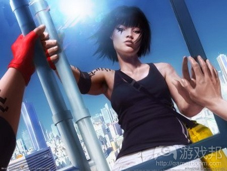
Mirror's Edge from wordpress.com
在获悉我们所有游戏内容后,游戏突然让我们获悉能够藏在货车背后,等待其穿过核查点。这是游戏之前所未传递的内容,这会让我们在最终发现游戏预期时感到非常气愤。我们一直试图以“正确”方式体验游戏,而游戏突然将正确方式变成错误方式。
推论:游戏告知信息不应和玩家预期有出入。
虽然在简单任务中浪费如此多时间令人倍感沮丧,但这真正伤害的是我们在随后关卡中所享受到的乐趣。我和朋友都被灌输这样的思维,觉得《镜之边缘》是款通过屋顶及借助速度和灵敏度寻找出路的游戏,游戏有时还需点击货车后门,以隐藏入内。
在游戏随后部分,当我们面临某无法解决挑战时,我不得不开始怀疑问题是否存在基于运动的解决方案,开始试图操作之前尚未试过的内容(游戏邦注:以防设计师送给我们另一曲线球)。四处游走和点击内容并不是游戏原本意图传递的内容,所以将货车元素加入问题解决方案选择中,会导致玩家无法享受到游戏乐趣。
这个例子也是用于说明首个原则的重要性:若你希望玩家飞梭游戏空间获取乐趣,他们却缓慢游荡点击内容,你需弄清是哪个游戏内容鼓励此行为,将其移除。
3. 玩家最常开展的活动应最易操作。
这个原则不仅适用游戏设计,而且适用任何设计活动。因此通过工业设计例子着手最简单。
先来看看闹钟UI按键图像。有若干小按键用于调整时区、年份和时间,还有个巨大闹铃暂停按键。闹铃暂停按键与闹钟时间调整、时间设定或日期设定之类的按键大小应成何比例?就我看来应超过100:1。若暂停按键和时区按键大小相同,或者甚至更小,这将是个非常糟糕的设计?
锤子只做两件事,其中一个作用比较不常见,但依然非常重要。锤子是个非常奇特的模式,具有合乎人体工程学的夹头,还有个弯曲的手柄。你觉得哪个是手柄的最佳形状设计,是以一边敲击钉子,还是以另一边将其拔出?他们似乎在爪子上耗费不少功夫,但我敢保证其钉子拔出效力不会影响钉子敲击效力。
这些都是显而易见的例子,但有很多电子游戏更像瑞士军刀,你需在使用前,定位和部署所寻找的工具。根据所要采取的行动,即便是点击额外按键,点击额外鼠标按钮,或拓展额外菜单页面,都会逐渐演变成巨大不便。
下面来看看MMO游戏例子。在这类游戏中,玩家常常要进行的活动如下:
* 决定敌人挑战难易
* 打劫暴民
* 发现和寻找关卡
* 呈现关卡
* 根据当前设备评价既有工具
* 购买新技能
* 加入团队
列表末尾的道具不如前列道具常见,但头两个任务玩家平均每分钟要操作若干次,随后两个则每小时若干次。在MMO游戏中,玩家能够轻松、无意识进行前列内容,新玩家能够无需诉诸指南或网页发现末端任务,非常重要。
留心此规则如何同之前的规则互动:玩家希望重要内容能够简单进行操作,但若游戏将“错误”内容呈现给玩家,告知他们这是最简单的操作,他们就会频繁进行活动,若你希望阻止玩家进行某操作,就要查看是哪部分UI设计鼓励他们进行此内容,进行相应调整(游戏邦注:举个简单的例子:若游戏并非不提倡玩家追捕或恐吓其他玩家,那就不要在缩略地图呈现敌对玩家及其角色姓名)。
我不倡导遵循固定游戏设计原则,但我相信任何设计师只要遵循上述3条原则,定会创作出高质量游戏,不论游戏机制如何,将更加趣味横生。
游戏邦注:原文发布于2008年11月28日,文章叙述以当时为背景。(本文为游戏邦/gamerboom.com编译,如需转载请联系:游戏邦)
3 design guidelines that will improve any game
by Mike Darga
In general, I disagree with people who try to teach design as a long series of rules to follow. I believe that any good game design depends heavily on context. The best death mechanic in a PvP game might not be the best decision for a PvE game; the best control scheme for a 3rd-person brawler won’t necessarily feel good in a first-person shooter, the leveling curve must feel different between a “casual” and a “hard core” game, etc.
I’m a very systematic, process-oriented designer, and so I tend to think that the best way to design is to establish a list of values, then work through a thorough design process, using the values and context to weigh each design decision. I’ll write a much longer post on this later, I’m sure.
All those caveats aside, I do believe there are 3 very generic guidelines that can improve any game, and that I will always follow in every game that I design. 2 of them are about teaching players, and 1 of them is about usability, so I suppose that gives a pretty accurate picture of what my priorities are.
1. If you want to change your players’ behavior, you need to change your game design.
Letting players loose on your game for the first time can be a very jarring experience for new designers. It’s the moment that you often find out the game that you thought you made isn’t the game your players think you made. And the players are always right, so let me save you months of frustration by telling you not to try and fight it.
Almost all of the funniest war stories game designers tell each other are really about the difference between how the design team expected the players to use a system, and how the players ended up actually using it. There are some very famous example of this effect, which deserve a post of their own later. The important thing to take away now is that the players are not just crazy. They’re using your game in the way that they’ve been encouraged to, either mathematically, psychologically, or socially.
Practically any behavior can be encouraged, discouraged, or prevented by careful game design, especially reward systems. If players are misbehaving, it is likely because the game design is allowing or even encouraging it.
2. The game must teach the player what the game expects the player to know.
I was watching a friend play Mirror’s Edge the other day. He’d been playing it for several days, and was well over halfway through the game. After reinforcing in mission after mission that the game is about running across the rooftops, relying on speed and agility to save you, the game suddenly stumped us with a new requirement: After trying everything we could think of to get high enough to jump over a barbed wire fence, we finally noticed that when we stood on the ground next to the back door of a truck, we had the option to interact with the door, and enter the truck.
After all the learning we had done in the game, the game suddenly required us to know that it’s possible to hide in the back of a truck and wait for it to be driven through a checkpoint. This was something the game never taught us previously, which made us angry when we finally realized what we were expected to do. We had been trying to play the game the “right” way, and suddenly the game decided that the right way was now the wrong way. Which leads me to a sidenote…
Corollary 2A. The game should never teach the player to do something the player is expected not to do(!!)
While it was frustrating to waste so much time on what should have been a simple task, the real damage may have been done to our ability to enjoy the game in subsequent levels. My friend and I have now both been trained to think that Mirror’s Edge is a game that’s almost always about finding a way through the rooftops and using speed and agility, but also sometimes a game about clicking on the back door of a truck to hide in them.
For the remainder of the game, when we are presented with a challenge that we can’t figure out, we will now be compelled to doubt that there is a movement-based solution to the problem, and start walking around trying to interact with things that never did anything before, just in case the designers decided to throw us another curve ball. Walking around and clicking on things is specifically what the game is not intended to be about, so by adding that to the list of problem-solving options at our disposal, that unnasuming truck is forcing players away from the core of the game’s fun.
This example also serves to illustrate how important guideline number 1 is: if your players are walking around slowly clicking on things when you want them to be flying through the landscape having fun, figure out what aspect of your game encouraged that behavior and remove it.
3. Whatever actions the player will perform the most often must be the easiest actions to perform.
This gui9deline doesn’t just apply to designing games, but to designing anything at all. (Despite this being a game design blog and me being a game designer, I believe that many tenets of good design apply to any type of product.) Because of that, it will actually be easiest to convey with examples from industrial design.
Take a look at this image of an alarm clock’s UI buttons. There are tiny buttons to change the time zone, the year, the time, and a giant snooze button. What’s the ratio of the number of times you want to tell your alarm clock to snooze versus do any other thing such as change alarm time, set the time or date, or anything else? I’d guess in my case it’s over 100:1. How silly would it be if the snooze button were the same size as, or even smaller than, the time zone button?
A hammer only does two things, and one of them is much less common, but still important. This hammer is a pretty fancy model with an ergonomic grip and a curved handle. Which do you think the shape of the handle is optimized for, hammering in nails with one side, or pulling them out with the other? It actually looks like they’ve put some effort into angling the claws so that there’d be better leverage when pulling out nails, but I can guarantee you they wouldn’t allow nail-pulling comfort to interfere with nail-hammering comfort or effectiveness.
Ok, these are insultingly obvious examples, but there are lots of videogames that are more like a swiss army knife, where you’ve got to locate and deploy the tool you’re looking for before you can use it. Depending on the action you’re trying to perform, even hitting one extra keystroke, clicking one extra mouse button, or expanding one extra menu page can build up into a huge amount of perceived inconvenience over tens and hundreds of hours of use.
I’ll delve into this more later, but let’s take some quick examples from an MMO. In this type of game, there are a set of actions that players are frequently expected to perform:
* Determining how difficult a challenge an enemy poses
* Looting mobs
* Finding and accepting quests
* Turning in quests
* Evaluating a given piece of gear against current equipment
* Purchasing new abilities
* Joining a team
The items to the bottom of this list aren’t as common as the ones at the top, but the first two on the list might be performed several times PER MINUTE, and the next two many times per hour. It’s important in an MMO that those tasks at the top of the list can be performed almost effortlessly and without conscious thought, and those at the bottom of the list can be found very easily by a new player without having to resort to a manual or webpage.
Again, take note of how this rule interacts with the previous rules: Players need what’s important to be easy, but if the “wrong” things are presented to them as the most easy to do, they’ll be taught to perform those actions frequently, and if you want to stop the players from doing something, look at what aspect of your UI design is encouraging them to do so and change it. One quick example: if your game is not about players tracking down and terrorizing other players, don’t show enemy players and their screennames on the rader/minimap.
I hate to encourage the idea of immutable game design rules, but I do believe that any designer who follows these 3 guidelines will produce games that are of higher quality and more likely to be perceived of fun, regardless of their mechanics. (Source:mikedarga)