总结Android手机应用UI设计的10个要点
作者:Guenther Beyer
最近,许多开发者进驻手机领域,小团队也能够构想出优秀和独特的想法,使用业余时间便足够来开发应用。
每个开发循环迟早到会走到应用几近完成这个点。接下来要做什么呢?你可曾听说过“用户体验”这个词?以下这10个技巧能够使新手机应用在发布前提升质量,最大化发掘该应用的潜力,从而最小化用户差评和低下载量这种不良结果。
1、首次开启体验
优秀的网站和手机应用有诸多相似之处。这两者都能够迅速吸引用户或访问者。如果没有做到这点,用户很可能会转而寻找其他替代品。多数用户不愿意浪费时间来弄清楚要如何运行应用或阅读复杂的教程。他们会选择放弃该应用。
首次开启应用时,每个人的脑中都会浮现出相同的3个问题:我在哪里?我现在能够做什么?我接下来能够做什么?
努力使应用立即对这些问题做出回答。如果你能够在前数秒的时间里告诉用户这是款适合他们的产品,那么他们势必会进行更深层次的发掘。
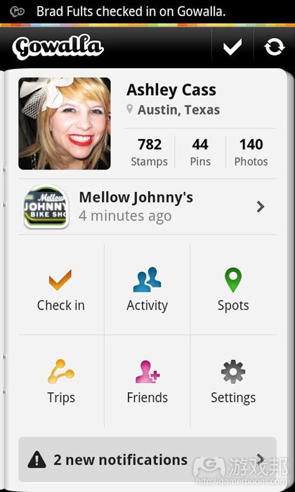
(Gowalla有着良好的首次开启体验。护照缓缓打开,让你可以立即查看个人信息、即时建议以及更多的动作和通知。)
2、便捷的输入方式
想想看你是如何使用手机设备的:开发者的手机安静地躺在平坦的桌面上,连接到配有大型键盘的PC上,或许还完全打开背光功能。现在,想想其他人如何使用他们的智能手机:走在熙熙攘攘的大街上,一手拿着杯咖啡,另一手拿着设备,努力弄清楚他们最喜欢球队的表现情况。
在多数时间里,人们只使用1个拇指来执行应用的导航。不要执拗于多点触摸以及类似的复杂输入方法,要多考虑滚动和触摸方式。让人们可以迅速地完成屏幕和信息间的切换和导航。让他们可以快速获得所需的信息,珍惜用户每次的输入操作。
(你只需要简单的触碰和输入文字就可以给Taskos应用添加新任务。当然,你还可以修改许多设置,但这些都只是可选操作。)
3、对比度
你的开发环境或许是有着大型屏幕且光照适当的房间,但用户使用应用的环境可能并非如此。尽管我们不愿意,但是我们确实常需要在阳光强烈的环境下使用手机设备。这种情况会对我们观
看屏幕产生很大的影响,界面设计时应当考虑到这点。在上述不佳条件下,可能会导致细节丢失,颜色分辨不清,某些元素因阳光反射而完全消失。
这并不意味着你只能将界面设计成黑白样式,抛弃UI设计中所有漂亮的细节。这仅仅意味着,重要元素应当有足够的对比度,使之在此类条件下能轻易识别。如果你想要给代码元素上色,那么要添加简单文字标签之类的选项。如果你想用小细节和信息来改善应用外观,这也是可以的,只是要确保你的UI没有这些元素时依然能够运转。
为界面设置清晰的等级,大而明亮地呈现最有价值的功能,将任何不重要的内容完全移除。
(虽然SoundHound的屏幕上有着许多选项,但是主要功能用明亮和加粗的字体清晰地呈现在界面顶部。)
4、不要让用户等待
没有人喜欢等待,在移动领域中尤其如此。我们将设备带上火车,在汽车上快速回复邮件,或者在走出屋子的时候查看天气预报。我们利用时间间隙来做这些小事情,来换取更多时间做真正喜欢做的事。不要让人们等待你的应用做某件事情。提升应用表现,改变UI,让用户所需结果的呈现变得更快。
当然,所有人都能够理解,有些任务需要花一定时间来执行,或者应用需要从网络上下载某些容量较大的数据包。但是不要让用户毫无意义地等待。要让他们感觉到任务正在执行中。为按键添加“选择”或“按动”的状态,加载时间较短时可以添加旋转符号,加载时间较长时可以使用进度条。但是,绝不要让用户面对空无一物的屏幕。
等待总是令人苦恼的。至少要让用户知道他们还需要等待多长时间。
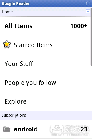
(Google Reader应用在设备顶端显示一个小的旋转符号,每当应用在后台加载内容时这个符号就会出现,这样你就会意识到自己或许需要等待一段时间。)
5、不要忘记横向呈现方式
有时,你或许会忘记手机设备不只有单一的纵向呈现。虽然多数人能够适应只支持纵向模式的应用,但确实有某些人喜欢横向使用他们的设备,尤其是那些有着实体键盘的设备。随着Android平板电脑的流行,这类用户的数量可能会逐渐增加。
不要认为横向模式只需简单地加宽应用界面。横向使用设备有着完全不同的用户体验。在这种情况下,你可以用两个拇指与屏幕互动。输入变得更为简单,而且多数情况下你会由左向右阅读,不是由上向下。事实上,如果你的应用需要大量的阅读和文字输入,那么绝对要有良好的横向模式。
对用户来说,横向体验是完全不同的。你可以利用这种更宽的布局,以完全不同的方式呈现信息。比如,之前位于屏幕上方的按键可以移动到屏幕一侧。利用更宽的屏幕,地图、图表和图片可以呈现新的信息。
(先构建和改善一种屏幕方向,然后再制作另一种。注意每种布局的利弊,睿智地加以利用和改良。YouToube应用官方版本为不同的方向模式设计了不同的布局,两者都在各自的纵横比下完美地运转。)
6、应用生态系统
尽管你能够设计出为用户多种不同目标服务的独特应用,但它永远都只是整个动作系列的一个步骤。
想想看你的智能手机所具备的功能:电话记录、联系人、短信息、邮件、浏览器、拍摄照片和视频、GPS和地图等。利用这些功能。对于所有这些已构建的模块,你无需自行制作。用户已经很熟悉这些标准工具,不要在这些内容上浪费精力。
以下是个简单但极为普遍的动作流程:接到邀请你前往某个地点的电话。查看时间。查看天气。用Google Maps搜索该地点。用Foursquare签到。那么,你的应用要同整个流程中的哪个部分绑定呢?
没有用户会单纯为了你的应用而摆弄自己的手机设备。但是如果你成功制作了一款优秀的软件,他们会愿意将其整合到日常的手机使用流程中。让用户能够便捷地使用分享或在网络上搜索有趣信息等功能,使他们交替使用你的应用和其他应用。
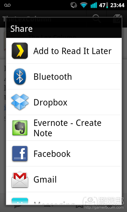
(许多应用会直接绑定Android的分享机制。你可以将此作为应用的优势。)
7、让你的应用更为独特
目前,Android Market上有数十万款应用。你或许会时常问自己,如何从如此多的同类应用中突出重围。如果你想要构建的又是一款无聊的黑白数独游戏,或者是基于官方代码范例的记录应用,那就很难获得可观的下载量。
不要认为目前市场上已经没有优秀应用的发展空间。用户偏好的应用类型各不相同。有些人偏爱几乎能够做所有事情的记录应用,有些人需要的只是带有同步功能的文本编辑应用,还有些人只是想要个有着清楚UI的记录应用。
无论你选择的是哪个方向,要构建带有一定特征的应用。操作系统和核心应用已经为用户提供了所有基本功能。制作某些能够用内置解决方案吸引用户使用产品,这样才能够脱颖而出。将你的应用视为住在智能手机中的小机器人。它与你交流,告诉你有趣的事情,帮助你完成日常事务。你希望自己的机器人聪明专业,还是精明可爱,抑或是滑稽搞笑?
在应用构建的开始就要记住这一点。人们喜欢与他们的个性相符的应用。如果你想要构建照片分享应用,可以为其添加各种主题和徽章。如果想要构建的是款定位服务应用,可以考虑将其简化成只具有最基本的功能,让所有内容自动化完成。应用设计愿景的微小改变可能会改变整个应用以及用户的使用方式。
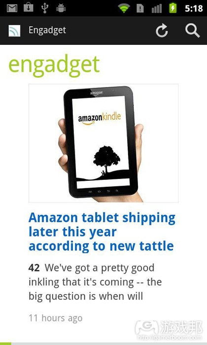
(Feedly也是款整合Google Reader的新闻阅读器,但是它使用类似于杂志的呈现方式和清晰的界面设计,这就是该应用与其他阅读器的不同之处。)
8、遵守平台指导原则
尽管你的目标是制作出独特的应用,但是并非意味着应用的每个部分都要完全与众不同。谷歌就Android应用的设计和开发提供了许多指导性原则。熟悉这些原则。人们能够用来研究现代智能手机的时间比你想象的要少。不要让应用中遍布自定义互动元素,这会让他们的操作更为困难。
学习使用Android设备需要用户适应触摸、输入、摇动甚至不时按动硬件按键等操作。他们需要识别输入区域、选择框、模式对话框和菜单等样式。你真的还想给他们增加更多的负担吗?
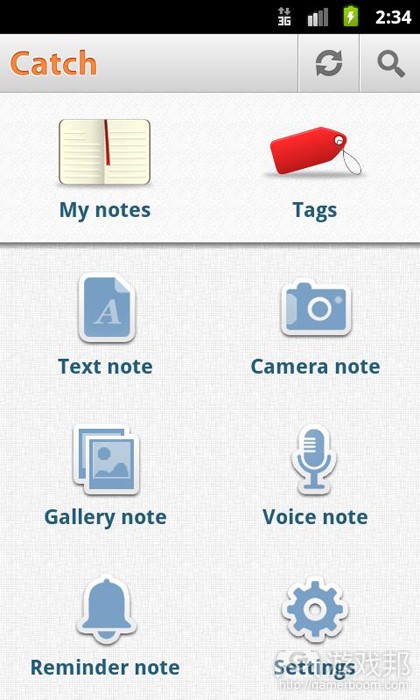
使用简单和直观的列表。在应用开启屏幕中,用大图标来呈现主要功能。添加标题作为最常用功能的入口,让用户能够随时返回开启屏幕。如果你无法显著提升某些操作的功能,那么就保持原样。人们会认同应用和整个操作系统的一致性。
认真研究谷歌的界面和决策。熟悉整个原则,并在开发应用时用上这些原则。但是,不可过于死板。如果你能够改良某些元素,而且你确信自己的做法比原则建议的更好,那么就勇敢去做!
(Catch Notes用户的多数动作可利用应用中的大图标功能实现,这款应用遵从了基本原则,因而运转良好。)
9、测试
所有的用户都各不相同,我们必须正视这个问题。你可以在应用中投入尽可能多的精力,但是你不可能令所有人满意。甚至连将应用制作成适合多数人的需求都是件很困难的事情。
不要误解我的说法。你在发布应用前,必须考虑到不同人可能会有不同的使用方式。你需要不同的人来测试应用,由此找出最恼人的问题和漏洞。大公司往往耗资数千美元进行可用性研究,在昂贵的实验室中让数百名不同类型的用户测试应用。
虽然这是个提升应用UI的绝妙方法,但多数独立和小型开发商无法承担如此多的费用。但是,也不要以此为借口而放弃应用测试。你可以开展成本低廉的测试,寻找不同的用户群体,由此来大幅改善你的应用,让其能够满足更多用户的需求。
将应用原型安装到你的开发设备上,花点钱购买些小礼物,开展应用测试。先从同事和好友开始,然后再以你从未见过的陌生人为对象。多数人都愿意花点时间来体验全新的东西,只要你足够礼貌甚至愿意为他们费时测试应用提供奖励。
让他们像你预期那样使用应用,然后细致地观察他们的使用过程。告诉他们目标是什么,但要尽量少提供帮助,但也别让他们卡在某个地方。很快,你就会发现应用的纰漏和瓶颈。
10、发布到市场上
你已经制作完成了自己的首个应用。感觉很棒,不是吗?
不要犯许多开发者犯下的某些错误。诚然,你想要将应用发布到市场上,看看用户会有何评价。但是,最后这几个步骤会让你的首次发布更为成功。
确认完成对应用的测试后,我们还需要考虑些小问题。
你上传到Android Market的应用还应该带有以下4种资产:
(1)应用功能描述
(2)高清应用图标
(3)呈现在Android Market上的小型推广条幅
(4)显示在网页版市场中应用旁边的较大“推荐”图像
不要低估这些资产中的任何一项。精心撰写的介绍和清晰且设计精美的图像会让你的应用显得鹤立鸡群。用户会察觉到你额外投入的这些精力。
如果制作清晰精美的图像或撰写介绍不是你所擅长的事情,可以寻求设计师和撰稿人的帮助。额外付出一些金钱会对应用的成功有所帮助,而且这些只需几个小时便可完成。
如果你想要在应用发布前就开始对其进行推广,可以注册Twitter账户,制作外观精美的登陆页面,开始宣传应用。对于营销而言,多早开始都不为过。培养人们对应用的兴趣,他们会在应用完工前就开始传播。
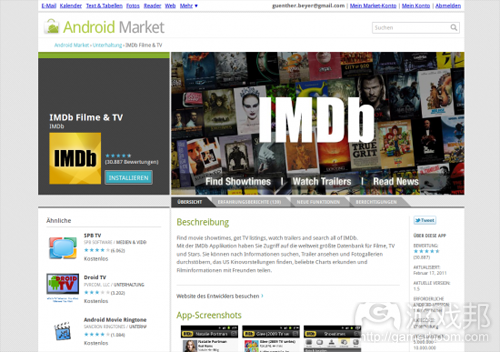
(Android Market网络版使用高清版本的应用图标和大型功能图像。)
游戏邦注:本文发稿于2011年5月11日,所涉时间、事件和数据均以此为准。(本文为游戏邦/gamerboom.com编译,拒绝任何不保留版权的转载,如需转载请联系:游戏邦)
10 Tips For Android UI Design
Guenther Beyer
These days many developers are jumping on the mobile train for fame and fortune – and they are right in doing so – there isn’t a market growing as quickly. Great, unique ideas are emerging from small teams. Apps are built at work on lunch breaks.
Sooner or later every development cycle gets to the point where the app is almost done. Now what? Heard of the two magic words “User Experience”? Well, you better, because the mobile world has its own set of patterns and rules of which you might not be aware. Here are 10 tips to improve your new mobile application prior to launch, maximizing your potential and minimizing your frustration due to bad reviews and low download counts.
1. First launch experience
Good websites and mobile apps have quite some similarities. Both need to connect to the user or visitor instantly. If they fail, the next best alternative is just a couple of clicks away. Most users will not waste their time trying to figure out how to use your app or read a complicated manual. They will simply move on.
At first launch, everybody will have the same three questions on their mind: Where am I? What can I do here? What can I do further?
Try to answer these questions instantly. If you can convince your user that this is the right app for them in the first couple of seconds, they will surely dive deeper.
(Gowalla has a beautiful first start experience. A passport opens slowly, giving you instant access to your personal information, instant suggestions and further actions and notifications.)
2. Every input is valuable
Think for a moment about how you really use your mobile device: a developer’s phone is safely sitting in its dock on a plain table, connected to a PC with a large keyboard, probably with full backlight turned on. Now think about how everybody else is using their smartphone: walking over a crowded street with a cup of coffee in one hand and his shaking device in the other, trying to figure out how their favorite team played, between the last meeting and the next one.
Most of the time people just have one (big) thumb to navigate through your app. Forget about multitouch and similar complex input methods – scroll, flip and touch are your friends. Let people navigate from screen to screen and information to information quickly, without the need to stretch their arms first. And let them get there quick. Every input counts.
(You can add a new task to Taskos with just one simple touch (and some typing, obviously). Right after that many settings can be configured, but these are all optional.)
3. Contrast
While your development environment might be a big, beautiful screen in a nicely shaded room, the place where your users use your app might not be. We need to use our mobile devices more frequently in bright sunlight than we would like to. This has a big influence on how we view the screen and how the interface should be designed.
Details get lost, colors can’t be distinguished from one another. Some elements completely vanish due to the reflections.
This does not mean that you have to design only in black and white and throw out every beautiful detail of your UI design. It just means that important elements should have enough contrast to be recognized as such under more stressed conditions. If you want to color code elements, add a fallback option like simple text labels. And if you want to improve your app’s appearance with small details and bits of information, that’s fine. Just make sure that your UI even works without those.
Give your interface a clear hierarchy by displaying the most valuable features largely and brightly. Remove anything unimportant completely from your app.
(While there are many options presented on the SoundHound screen, the main function is clearly displayed bright and bold at the top of the interface.)
4. Don’t let them wait
Nobody wants to wait, especially in a mobile world. We carry our devices on the train, answer a quick mail on the bus, or check the weather while walking out of the house. We do all these small things on the go, to gain a little bit of more free time for the things we really like to do. Don’t let people wait for your app to do a certain thing. Improve the performance of your app and tweak the UI to get to relevant results faster.
Certainly everybody will understand that there are tasks that require some heavy performance from your app or some large packages of data that need to be pulled from the web. But never let your users wait for anything to happen. Let them feel that something is working in the background. Add “selected” and “pressed” states to your buttons, add spinners for short loading times and progress bars to longer ones. But never, never, never confront a user with a black screen.
Waiting is always annoying. At least let your users know how long they will have to wait.
(The Google Reader app shows a small spinner in the top, every time some loading happens in the background, so you are always aware that you might have to wait a second or two.)
5. Don’t forget the landscape
Sometimes you just forget that your mobile Android device has more than one basic phone orientation. While most people are comfortable with their apps working only in portrait mode, some really prefer to use their device in landscape mode, especially the ones with physical keyboards. This group of user will probably grow with the widespread adoption of Android tablets.
Don’t make the mistake of thinking of the landscape orientation as a wider view of your lists. Using the device in landscape mode is a totally different user experience. Now you have two thumbs to interact with the screen. Typing is much easier and you mostly tend to read from left to right, not top to bottom. In fact, if your app is heavy on reading and writing you absolutely need to support a good landscape mode.
Landscape orientation can also feature a totally different experience to the users. You can use the wider layout to display information in a completely alternative way. For example buttons could be moved to a side that were previously sitting at the top of the screen. Maps, charts and graphs can display new pieces of information when shown on a wider scale.
(Start to build and improve one screen orientation. Then create the second one. Be aware of the pros and cons of each layout and use them wisely. The official YouTube app uses two different layouts for the two orientations, that both work perfectly at their respective ratios.)
6. App Ecosystem
While you can design the most unique and special app that might serve a lot of different purposes, it will always be just one step in a chain of actions.
Think about what your smartphone can do out of the box: phone calls, contacts, texting, mails, browser, taking photos and videos, GPS and maps – the list goes on. Use this as an advantage. You don’t have to create all these building blocks on your own. Users are familiar with the standard toolset – don’t try to reinvent the wheel.
At the same time this will also spare you a lot of coding work.
Here’s a very short but very common chain of action: Get a call that invites you to a certain location. Check the time. Check the weather. Head out, searching the place with Google Maps. Check in with Foursquare. So where does your app tie in the workflow here?
No user will ever use his mobile device just for your application alone. But if you manage to create a great piece of software, they will incorporate it into their mobile workflow on a daily basis. Give them easy access to further features like sharing or looking up interesting information on the web, and let them jump fluidly between your app and others.
(Many apps can hook directly into the Android’s sharing mechanism. Use this to your advantage.)
7. Make your app unique
There are more than 200,000 apps on the Android Market. You might ask yourself how to stand out between all the quite similar offerings. If you set out to build the next boring Sudoku game in black and white or the next note-taking-app based on the official code example, you will have a hard time getting some decent download numbers.
Don’t assume that there’s no room for another great app that is already covered in one way or another. People always prefer different things. There is no Jack of all trades. Some prefer a note-taking-app that can do almost everything. Some need just a simple text editor with syncing capabilities. And there are others that just want a clean UI.
Either way you go, build an app with character. All basic features are already covered by the OS and the core apps. Stand out by creating something that users will prefer to use over the built-in solutions. Think of your app as a small robot living inside your smartphone. It communicates with you, tells you interesting things and helps you with your daily tasks. Do you want your robot to be smart and professional, or cute and lovely, maybe even cheeky and funny?
Keep that in mind when building a great app from the ground up. People with character enjoy apps that fit their personality. Want to build a photosharing app? Add a paparazzi like theme to it, with badges to earn. Another location service? Strip it down to the most basic features and automate everything. Take a problem with an already well known solution. Now think about, how a slight change of perspective could change the whole application and how users work with it.
And don’t let me get started with good UI design …
(Feedly is just another news reader with Google Reader integration, but it uses a magazine like presentation and very clean design to distinguish itself from other readers.)
8. Stick to the guidelines (as long as possible)
While you want to create an unique app, that stands out, you don’t want every piece of your app to be totally special. Google suggests a lot of guidelines for Android app design and development. Get familiar with the guidelines. People have a much harder time to dive into the complexity of a modern smartphone than you think. Don’t make it even harder for them by implementing custom interaction elements all over.
Learning to work with an Android device need a user to get comfortable with touching, typing, swiping, shaking and even pressing hardware buttons from time to time.
They need to recognise patterns like input fields, select boxes, modal dialogs and long presses for contextual menus. Do you really want to throw more at them?
Go with simple, straight forward lists. Start your app with a dashboard consisting of big icons for the main functions. Add a header that provides access to the most common feature and let users go back to the start when they get lost. If you can’t improve these metaphors dramatically, don’t change them. People will value consistency within your app and the whole operating system.
Study Google’s interfaces and decisions carefully. Get familiar with the whole experience, and try to create your app with Android’s guidelines in mind. But don’t take this literally – If you can improve certain elements, and you are absolutely sure about that – then for God’s sake, do it!
(Frequent actions in the title bar, big simple, icons on the body. Catch Notes works great by sticking to the basics.)
9. Guerrilla testing
Let’s face it – all users are different. You can try as hard as you want to, you’ll never satisfy everybody. Even trying to get your app right for the majority of people is very hard.
Don’t get me wrong here. This is no excuse to ship your app without considering the different approaches of how people will use the app. You need different people to test-run your app and iron out at least the most annoying problems and bugs. Big companies spend thousands of dollars on usability experts, that test hundreds of different users in very expensive labs to get their software right.
While this is a great way to improve any app’s UI, it is hardly affordable for most independent and small developers. Don’t let this be an excuse, either. You can do some very cheap and swift guerrilla testing, to massively improve your app and make it more accessible to a larger userbase.
Grab your developer device with the app’s prototype, spend some money on small gifts like buttons or stickers, and head out. Start with colleagues and friends, and progress to strangers you never saw before. Most people will gladly spend a little time with something brand new, as long as you are polite and even provide a small reward for their time.
Let them use your app like you intended to, and watch carefully. Tell them what their goal is, but provide as little help as possible. But don’t let them get stuck either. You’ll figure out your apps pitfalls and bottlenecks in no time.
10. Publishing to the Market
Well, you did it. You’ve built your first app. Congratulations. It feels great, doesn’t it?
Now don’t make the mistakes many do. Sure, you want to get the app out to the masses and hear what they are saying about it. But taking a couple of last steps will give you a much better first launch.
You’re sure you did some proper testing? Different devices, hdpi, mdpi and ldpi? Alright. Let’s take care of the small things.
Google wants you to upload your app to the Market with 4 additional assets:
A description of your application’s features
The app’s icon in high resolution
A small promotional banner that will be displayed on the Android Market
And another larger “features” graphic that will go alongside your app on the web-version of the market.
Don’t make the mistake and underestimate one of these additional assets. A well written introduction to your great app coupled with some clean and well designed graphics can make the difference to all your other 500 contenders on the Market. Users will notice the extra mile you took, transcending over to the level of detail and care you put into your application.
If creating some nice and clean graphics or writing some lines of good copy isn’t really your cup of tea, ask a designer and/or writer. The extra money should be well worth your apps success, and it should take only a couple of hours.
If you even want to take your promotion a little further prior to launch, get a fitting Twitter account, create a beautiful landing page and start the buzz. You can’t start marketing too early. Let people get excited. They will spread the word for you long before your app is finally available.
(The Android Market online uses the high-resolution version of your app’s icon and the large feature graphic.) ( Source: Phandroid)
