针对iOS和Android开发应用的10点建议
作者:Kristofer Layon
手机应用如今日益变成许多用户的日常技术。这些应用无疑还非常新颖,目前不是所有人都持有智能手机。但现在称手机应用举足轻重就和说纸张无处不在一样。
这并不是玩笑话。手机技术相当于现代版的纸张技术。但我们不再将纸墨当作“技术”,是吧?这因为它们同我们的现代日常生活不可分割。
手机应用变得同样不可分割是因为,它们越来越多涉及我们的生活内容——我们的日常生活。我们越来越多利用手机应用查看或追踪世界新闻,访问我们定期查看的各类内容。
为何用户能够通过这一小小的手机屏幕访问如此多内容?和房地产一样,这主要涉及地理位置。据谷歌Marissa Meyer表示(游戏邦注:她在South by Southwest谈论手机应用的用途),Google Maps有1.5亿位用户——40%的用户通过手机设备运用这一应用。就查询行车路线的用户而言,他们在Google Maps查询的日常路线数量总计3500万英里。没错:每日3500万英里的行车路线。
但位置并非只是内容。它也是语境。手机应用很受欢迎是因为信息需求无处不在。我们想要在旅行时浏览时事新闻,在购买杂货时查看食谱,告知好友新鲜趣事,就在事件刚发生时的位置。
如果你想要设计基于内容的原生手机应用,下面有10点建议。这是我投身iOS和Android应用开发3年所得到的经验总结。
1. 考虑运用代码框架
说到运用JavaScript技术,这里有两个主要的网页设计师阵营:推崇自己编写自定义JavaScript的设计师;倾向采用jQuery或YUI之类框架的设计师。我更多属于后者,因为我有更多的设计背景,在编程方面接触不多。
所以学习Objective-C对我来说是个很大的挑战。在设计我的首款应用时,我尝试自己编写Objective-C,这耗费我好几个月时间。有过这一惨痛经历后,我放弃再次进行这样的尝试。
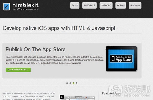
幸运的是,我发现了Objective-C代码框架——除非你是位很杰出的程序员,否则我建议你放弃学习Objective-C,采取和我一样的策略。在这之中,NimbleKit尤其出色。苹果网站的Development Tools版块强烈推荐这一工具,其中包含很多预先编写的Objective-C原生界面组件和行为调用(游戏邦注:最新Android版NimbleKit也包含相同内容)。
NimbleKit能够让你快速进入应用设计,在此过程中帮你省下很多麻烦事。原因是什么?你无需编写Objective-C,而只需处理HTML、CSS和JavaScript——作为网页设计师,这些语言你原本就很熟悉。
2. 内容不是游戏
我一点都不排斥游戏。我个人也有涉足游戏设计。和其他人一样,我喜欢用iPhone玩游戏。但我想说的是,在多数情况下,手机内容设计和游戏设计截然不同。游戏通常融入内置挑战,例如需要快速掌握的用户界面及完成预期目标所需克服的刻意障碍。这些在游戏设计中没什么问题:这就是游戏的构成要素,是吧?
但除非你设计的是基于内容的游戏,否则不要将基于内容的手机应用变得过于富有挑战性。这就引出第3点内容。
3. 熟悉手机人机界面指南
苹果在其iOS Dev Center网站发布了许多有关iPhone、iPod touch和iPad界面指南的材料。只要你注册成为Apple Developer,所有这些内容就都将免费呈现——内容不胜枚举。
但尽量多阅读这些内容。
4. 运用熟悉的UI设计模式
设计师总是忍不住想要在界面设计上进行创新。但不要将进行创意工作的乐趣同需要就所设计的所有内容进行创新混淆。就众多用户界面而言——尤其是基于小型手机屏幕,呈现熟悉内容就是创造乐趣和效率。
但这是手机平台,持有手机设备的用户都是创意人士,是吧?完全错误。
5. 针对普通人进行设计
在工作或设计会议中投入大把时间的设计师会倾向于认为持有iPhone和iPad设备的用户是“创意人士”,我们忘了我们并非这些设备的唯一粉丝。其实,手机设备旨在瞄准大众用户。是否记得苹果融入生活内容?人人都利用生活内容。
将普通用户牢记于心并不带有什么精英主义色彩。我并不是说,“普通用户”需要更简单的界面,因为他们“悟性”不高——而是说,大家可以从简单而精致的界面中受益。虽然从风格角度看,杰出设计有时被认为是有些精英主义,但网页和手机设备的设计若要成功,绝对不能带有精英主义。简单、精致,甚至是“日常化”是明智选择。
但内容问题呢?
6. 生活内容就是日常内容
在我看来,融入这些内容是我设计工作的关键。通常设计师会将内容或他人的商业需求塑造成有用的网页或手机服务或产品。我们需要在他人的需求中寻找机会。
下面就来看看一个我的手机应用市场:医学应用。在此我们需要注意两点:
* 我没有医学背景,所以这不是我的专业领域。
* 细分市场存在很多机会。
事实上,除新闻、零售或社交媒介外,多数内容都非主流。
这是一个最终悖论:医学内容也许并非主流,但对于有需要的用户而言,这依然属于日常内容,即便这是细分市场中的内容。这引出下一点内容。
7. 和他人合作
NimbleKit之类的Objective-C代码框架让你能够无需同程序员配合就能够制作出杰出的原生应用,但不要因此觉得你应该独立完成制作工作。如果你拥有对他人有价值的应用构思,那么就太棒了。但你还可以选择和拥有很棒构思及发展机会的内容提供者合作,在应用设计中采用按服务收费或收益分成模式。
所以不要因没有应用构思就放弃设计手机应用:要超越自己。除发表博客外,你多半不会基于自己的内容设计网站。将手机应用设计看作是新的服务提供方式,同他人合作,利用他们的应用构思。
8. 广泛思考你的内容选项
不要认为屏幕较小就意味着手机应用存在较小的内容发挥空间。基于手机设备设计应用其实可以扩宽,而非减少内容的范围。
举个例子,想想地理定位。某人现在位于何处是你可以融入应用中的最重要信息。如果产品、服务或组织是基于物理位置,那么地理定位就起到显著作用。虽然常规浏览器和计算装置开始支持地理定位,但这依然主要存在于手机设备和应用领域。
9. 测试易用性和易读性
手机应用内容的易用性和用户体验测试并没有因为设备屏幕变小而变得更加轻松。不要认为界面或格式选择适合你,它就适合其他用户。尽早、频繁进行测试。
最重要的是,不要因为这不是简单地向他人发送URL就跳过易用性和内容评估工作。的确,手机应用评估需要你静静坐下来同试验你应用的用户共处。但你从中得到的反馈信息将让这一切变得非常值得。
10. 在各种平台设计各式各样的应用
如果和许多网页标准及NimbleKit设计师一样,你刚开始基于苹果iOS系统设计手机应用,不要忘记Android NimbleKit是更可取的选择。尽管Android和iOS存在许多相似之处,但设计Android版应用,通过Android Market进行发行或推广依然颇具价值(游戏邦注:就体验和机会而言)。它向你呈现截然不同的用户界面和体验,将你或你客户的内容投放至另一片手机应用市场。
最终,记住通过网页标准设计原生应用意味着,你还可以轻松将原生应用改造成网页应用,前提是项目目标支持。如果你利用NimbleKit之类的代码架构,那应用的界面和内容就是通过HTML、CSS和JavaScript创建而成。这不过就是去除若干代码架构调用,修改应用样式表,也许还有添加若干额外平台和设备探测。
结语
设计内容应用,利用NimbleKit之类的代码架构,对于那些想要将既有标准设计体验扩展至新领域的网页设计师来说,这是个很棒的机会。(本文为游戏邦/gamerboom.com编译,拒绝任何不保留版权的转载,如需转载请联系:游戏邦)
Ten Tips for Web Designers Who Want to Design iOS and Android Apps
By Kristofer Layon
Mobile apps are becoming inseparable from our modern, everyday lives, because increasingly, they’re about life content—the content of our everyday lives. Designer Kristofer Layon lays out ten tips to consider when designing native, content-based mobile apps.
Mobile apps are rapidly becoming everyday technology for more and more people. Sure, they’re still new, and not everyone has a smartphone…yet. But it has almost reached the point where saying mobile apps have become a big deal feels a bit like saying that paper is popular.
In fact, that last comment isn’t just a joke. Mobile technology is indeed becoming today’s equivalent of paper technology. But we don’t really think of ink and paper as “technology” any more, do we? It’s because they’re inseparable from our modern, everyday lives.
Mobile apps are becoming just as inseparable because increasingly, they’re about life content—the content of our everyday lives. More and more, we’re using mobile apps to look up or track world news, recipes, travel plans, update each other, and to access any number of other content types that we use regularly.
What is driving people to access so much content on such small mobile screens? As in real estate, it’s all about location. According to Marissa Meyer of Google, who spoke at South by Southwest about mobile app use, there are 150 million users of Google Maps—and 40 percent of them use it on mobile devices. And for those users who look up driving directions, their daily total of routes looked up on Google Maps add up to 35 million miles. That’s right: 35 million miles of driving directions per day.
But location isn’t just content. It’s also context. Mobile apps are popular because information needs are also ubiquitous. We want access to current news when we travel, look up recipes when we’re shopping for groceries, and update our network of friends about some exciting news. Right after it happens, where it happens, and often as it happens.
If you are interested in designing native, content-based mobile apps, what follows are ten helpful tips to consider. They’re based on the many lessons I’ve learned during my three years of designing apps for iOS and Android.
#1: Consider Using a Code Framework
When it comes to using JavaScript, there are two main camps of web designers: those who prefer to write their own custom JavaScript, and those who prefer to use a framework such as jQuery or YUI. I fall more into the second camp because I have more of a design background and less of a programming background.
So when it came to learning Objective-C for making iOS apps, I had a challenging time. And while I managed to design my first app by writing my own Objective-C, it took me several months (and I ended up needing a lot of help). And after that ordeal, I wasn’t very interested in giving it another try, either.
Fortunately, I discovered Objective-C code frameworks—and unless you’re a really strong programmer, I encourage you to skip learning Objective-C and do the same. NimbleKit, in particular, is a great one. It’s featured in the Development Tools section of Apple’s website, and contains a ton of prewritten Objective-C calls to native iOS interface elements and behaviors (and the newer Android version of NimbleKit does the same thing on that side of the fence).
NimbleKit can greatly accelerate your entry into app design, and save you a lot of headaches (and heartaches) in the process. The reason? Instead of writing Objective-C, you’re writing HTML, CSS, and JavaScript—languages that you already know as a web designer!
#2: Content Isn’t a Game
I have nothing against games. I personally do not design them (yet who hasn’t wished they could design a blockbuster like Angry Birds?). And I love to play games on my iPhone as much as anyone. But my point is that, in most cases, mobile content design should not be too much like game design. Games often incorporate built-in challenges such as user interfaces that require steep learning curves, and other deliberate barriers to reaching desired goals. This is fine (and even expected) in game design: that’s what makes it a game, right?
But unless you’re designing a content-based game, don’t make your content-based mobile app unnecessarily challenging to use. Which leads me to my third point…
#3: Become Familiar with Mobile Human Interface Guidelines
Apple has published a lot of material in its iOS Dev Center website about iPhone, iPod touch, and iPad interface guidelines. Once you sign up as an Apple Developer, all of this content is free—more than you’ll ever have time to read!
But definitely try to read as much of it as you can, because you should…
#4: Use Familiar UI Design Patterns
Designers are often tempted to be innovative with interface design (I know this—I always used to feel this temptation, and still do sometimes!). But do not confuse your enjoyment of doing creative work with needing to be creative with everything that you design. When it comes to many user interfaces—and especially those on small mobile screens—delivering something familiar is delivering pleasure and efficiency.
But wait a minute: This is mobile, and people who use mobile devices are usually creative types, right? Wrong.
#5: Design for Your Audience…of Average People
We designers who spend so much time with each other at work or attending design conferences can become so acclimated to seeing “creatives” with iPhones and iPads that we forget that we’re not the only fans of these devices. Indeed, mobile devices are designed to be used by everyone. Remember Apple’s embrace of life content? Everyone uses life content.
And keeping average users in mind is not meant to sound elitist, either. I don’t mean to suggest that “average people” need more simple interfaces because they’re not as “savvy”—rather, I mean that everyone benefits from simplicity and elegance. Though good design is sometimes perceived as being elitist from a style point of view (and definitely can be elitist, especially with material goods), good design on the web and on mobile devices can never be elitist if it wants to be successful. Simple, elegant, and even “everyday” is good.
But what about that content issue, again?
#6: Life Content Is Everyday Content
For me, embracing this has been critical to my opportunities as a designer. More often than not, designers are shaping the content or business needs of others into useful web or mobile services or products. We need to look for and recognize opportunities in what other people need, people who may be nothing like us.
Let’s consider one of my mobile app markets: medical apps. There are two things to glean from this example:
* I’m not trained in medicine, so it’s not my area of content expertise.
* Niche markets can be significant opportunities.
In fact, other than news, retail, or social media, most content is not mainstream (and often, the more specific the content, the more value it can have).
And here’s a final paradox: Medical content might not be mainstream, but it can still be everyday content for the people who need it, even when it’s content for a niche market. Which leads me to the next point…
#7: Collaborate with Others
An Objective-C code framework such as NimbleKit can allow you to build a great native app by not having to collaborate with a programmer, but don’t think you should go it completely alone. If you have app ideas that have value to others, that’s great. But it can be just as effective to collaborate with a content provider who has a big idea and opportunity, and come up with a fee-for-service or revenue sharing model to fund the app’s design (and split the proceeds, if it’s not a free app).
So don’t let a lack of app ideas discourage you from designing mobile apps: Just look beyond yourself. With the exception of blogging, you probably don’t design websites with your own content, either. Approach mobile app design as a new service offering, and work with other people and their app ideas.
#8: Broadly Consider Your Content Options
Don’t think that smaller screens mean fewer content opportunities for mobile apps. Designing apps for mobile devices can actually broaden, rather than diminish, the range of content that is available.
As just one example, consider geolocation. Where someone is now (and where they might want to go) can be the most important information that you can include in an app. If a product, service, or organization is based in a physical place, geolocation is relevant. And while regular browsers and computing devices are beginning to support geolocation, it’s still largely the domain of mobile devices… and apps.
#9: Test for Usability and Readability
Accessibility and user experience for mobile app content is not necessarily any easier just because the screens are smaller. Don’t make assumptions that just because an interface or formatting option makes sense to you, it will make sense to your apps users. Test early and test often.
Most importantly, don’t let usability and content evaluation sneak past you just because the work is harder than emailing someone a URL. True, mobile app evaluation requires you to sit down and directly spend some time with someone who is trying out your app. But the feedback you get is worth every minute (and, as Steve Krug demonstrates to us in Rocket Surgery Made Easy, in-person usability is also a great way to evaluate websites).
#10: Design Multiple Apps, on Multiple Platforms
If you start designing mobile apps for Apple’s iOS platform, as many web standards and NimbleKit designers do, don’t forget that NimbleKit for Android is comparable to use. And despite Android having many similarities to iOS, there is a lot of value (in terms of both experience and opportunity) in designing Android versions of your apps for sale or distribution via the Android Market. It exposes you to slightly different user interfaces and experiences, and exposes your or your client’s content to another portion of the mobile app market.
Finally, remember that designing native apps with web standards means that you can easily repurpose a native app into a web app, too, should a project’s goals support that. If you use a code framework like NimbleKit, the app’s interface and content are created using HTML, CSS, and JavaScript! It’s just a matter of stripping out some calls to the code framework, modifying your app’s stylesheet, and perhaps adding some additional platform and device detection (there are a variety of methods for doing so).
Final Thoughts
Designing content-based apps, and using a code framework like NimbleKit, is an incredible opportunity for web designers who want to stretch their established standards-based design experience in a new direction. I hope these tips are helpful as you embark on this new adventure!(Source: peachpit)

